"IN THE CAUSE OF ARCHITECTURE":
COMMENTARIES IN MEMORIAM
Frank Lloyd Wright geometry 1
Frank Lloyd Wright's 1889 house
Frank Lloyd Wright was gifted with the aura of genius at a very early age. Whatever talents he inherited, or learned, probably came from his father, who was a man of aesthetic sensibilities; a musician, a preacher and a dance instructor. Wright was loath to give his father credit for anything except his biological role, but there is precious little artistic creativity demonstrated on his mother's side of the family to account for Wright's creative genius. There was, however, a plethora of moral certitude from the maternal family which manifested throughout Wright's lifetime, at least in his professional, if not his private life. Wright's genius is apparent almost from the day he left a demonic mother. Wright's first architectural employment at age 20 was in 1887 with Chicago architect Joseph Lyman Silsbee. Within a year he was working for Adler and Sullivan, one of the most important architectural offices in the country. With no formal training in the discipline, Wright became an accomplished architectural draftsman. At age 22, he became Sullivan's right hand man.
His rapid professional rise was a portent of things to come. In May of 1889, Wright purchased an Oak Park residential lot. In June of that year Wright and Catherine Tobin married and were in need of a family home. Anna, Wright's mother, came not far behind. She bought the adjacent property in August of 1889; another portent of things to come. Frank Lloyd Wright's house for his Oak Park property was his first built work. Sullivan provided the financing for construction of the house, which would have future implications, but for now the house got built. This scenario was pretty amazing for a 22 year old who had just left hearth and home a mere three years earlier. But this was Frank Lloyd Wright, and an early indication of his predilection for charging headlong, and victoriously, into uncharted waters. Wright's personality was part and parcel of his architecture. You cannot separate the two.
The first built work of Wright is remarkable for clarity and originality of concept, particularly when viewed in the context of its time. This is, after all, 1889, and the twilight of Queen Victoria and what we know as Victorian architecture. The idea of a contemporary architecture didn't start with Wright, but he seized upon the basic principals and made them his own. Horatio Greenough had developed a basic contemporary design philosophy as early as 1850 (Form and Function, Horatio Greenough, University of California Press, 1947 [See Library]). Even at an early stage of development this modest work by Wright bore what would become the hallmarks of Wright's work for the rest of his life. He possessed an intuitive understanding of art and architecture that manifested itself throughout his career, without his ever having the need for a strictly intellectual understanding of what he was doing. His approach was always philosophical and/or instinctive but not necessarily intellectual, probably his saving grace. He never let reason get in the way of instinct, which accounts for his many successes, but also a myriad of failures throughout his life and career. But that was the innate nature of Frank Lloyd Wright and there is no altering an original without doing harm. He always had to be Frank Lloyd Wright
Historians have repeatedly pointed out the influence of Price's Chandler house on this first work, and indeed there are similarities such as a veranda, and two diamond pane bay windows at the first floor surmounted by an overhanging gable roof with a Palladian motif window. This arrangement of elements occurs in the Wright house front elevation, but there is much more to this building than the front elevation. The usual photograph of the Wright and Price houses demonstrates not only the similarities with the Price house, but also the clarity of concept of the Wright house contrasted with the very mixed metaphors in the Price house. There a rather ungainly, shingled gable with a Palladian motif window tops the fake masonry half-timber infill at the second story above a pair of bay windows at the first floor. The front and rear dormer windows are unrelated to each other and to the adjacent roof surfaces. The structure also has a different roof type.
On the other hand, the Wright house has fully integrated second floor roof patterns and a masonry walled veranda that is part and parcel of the overall design of the house. There is nothing wrong with the veranda of the Price house. That design was the vernacular for its time and place, but it is just added-on and not part of the overall design. The Palladian motif window shows up on gable roofs all over the United States because the outline fits the triangular shape of the gable; nothing very unusual about that. But the vernacular is not the Wright approach, as he clearly demonstrates in this house. He takes a formal, very classic, approach. His aim was to leave no loose ends, to make everything part of the whole, and he very nearly succeeds.
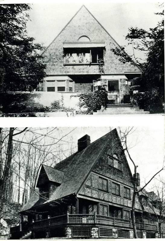 |
| Figure 1. Wright house above and Price house below |
However, an important question is raised by the mere implication of influence. If you want to explore the influence of history on the work of Frank Lloyd Wright, you need go no further than the Morris shop of 1948 and the influence of Richardson's Glessner house of 1885-87 on that design.
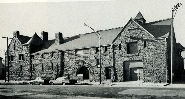 |
| Figure 2. Richardson's Glessner house, 1885-87.
Note service entrance. Photograph Cervin Robinson 1963 |
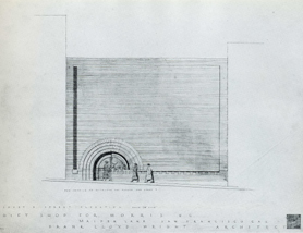 |
| Figure 3. Elevation of Morris Shop. Drawing #4824.008
© Frank Lloyd Wright Foundation. Used by permission. |
The Glessner house was under construction during Wright's first year in Chicago and he must have been aware of its existence. He carried the image of that service entrance around in his head for 60 years before it found expression. Werner Seligman says in "While it is certainly true that no architect lives in a vacuum, and that creative impulses are primarily based on stored reactions to existing work and ideas, it is, however, quite unlikely that there exists, for the truly creative mind, a single, predominant inspirational source. For a true architect, the mind constitutes an unfathomable storehouse of information and impressions that in the process of creating lose their identity and are converted into something new." (Frank Lloyd Wright, A Primer on Architectural Principles, Princeton University Press, 1991, page. 60). That was particularly true for Wright.
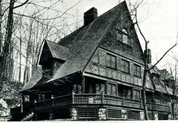
If you want an example of a house that may really show an influence of the Price's Chandler house you just have to look at the rebuilt Moore house of 1923. They are both two story houses, including an attic story, masquerading as one story houses, something that Wright's 1889 house was not.
 |
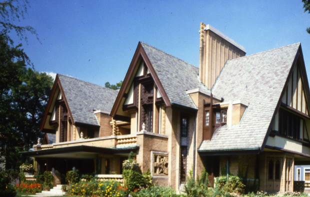 |
| Figure 4. Price house | Figure 5. Moore house |
There are three features in the Wright house that will become a permanent part of his architectural vocabulary for the rest of his life. The first is the integration of the architecture with the environment; the second is the horizontal banding of architectural elements; and finally and probably the most significant, is the emergence of geometry in every aspect of the work, including the roof pattern. This would, in the future, be particularly true of the hipped roofed houses. By nature, the hip roof is a simple rectangular shape that does not accommodate variations from the norm without becoming overly complicated. To a lesser extent the same is also true for the gable roof, and even less so with the flat roof, but the geometric roof pattern remains as a dominant determinative for the rest of his designing life.
PHASE ONE: CONCEPT
As an individual work of architecture the Wright house is not so remarkable in itself, but is rather important for the ideas represented in it. To understand this house, one must necessarily take the same approach as Wright did. That avenue begins with an idea. Wright says "…And I can truthfully say if not modestly, that not one of my buildings great or small but was the working out of some single minded far reaching idea, the practical demonstration of many principals at work…" (An Autobiography, page 253). The important word here is "IDEA." In this case the idea is a simple square first floor plan surmounted by a gable roof with an equal overhanging on all four sides. The eaves are boxed and the gable face is pulled out to form a tight eave with the gable.
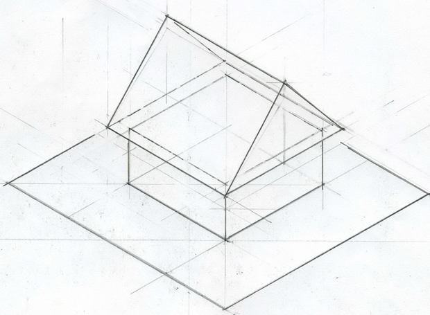 |
| Figure 6. Conceptual Isometric © John W. Geiger |
I have shown the basic square plan seated on a symbolic base, platform, or stylobate because Wright thought of the house as being firmly rooted to the ground. He saw clearly the gable roof as a pentahedron atop a cubic base. This concept is dominant from whatever vantage point you view the house. The main gable roof is always the dominant feature. The length of the ridge, when viewed from any perspective other than a straight on front view, gives a clear idea of the volume of the house and reinforces the geometry of the main gable roof as a pentahedron.
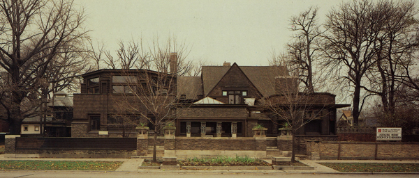 |
| Figure 7. House showing the full main gable. Frank Lloyd Wright Preservation Trust |
My primary interest here is to show how Wright conceptualized the building, and how that is documented in the working drawings. The drawings are apparently by Wright but the lettering is not in Wright's mature hand. Also the orientation of the building as indicated on the elevation is rotated 180 degrees from what it actually is; the street elevation is called the East Elevation instead of west, etc. Wright obviously knew the correct orientation, so the possibility exists that the house was originally designed for a different site.
The main body of the house, the essential-square, is 28'-8" by 28'-6" having a plate height of 9'-3" with a dining room add-on of of 6'-8" by 13'-0" using the same plate height. The main gable roof overhangs the essential-square by 3'-2" on all four sides. That is what this house is all about. No matter what has happened to the house throughout its life span, the main gable remains inviolate and the essential characteristic of the house. The dining room add-on was a practical necessity, one Wright treats as a subordinate feature that never interferes with the big "idea." The dining room, pantry, inglenook and kitchen form their own dining-rectangle that is congruent with the essential-square on two sides. At the second floor the form becomes two bedrooms and a bath.
The verandas at the front of the building, the footprint of the house itself, and the back porch veranda, combine to become a single horizontal plane bound on three sides by a railing height exterior masonry wainscot. The dining-rectangle holds the north and south walls of the wainscot in place by congruency with the essential-square which, in turn, is congruent with the stylobate on only one side, setting up a different relationship with the stylobate. The extension of the masonry railing beyond the dining-rectangle at the back of the building embraces the back porch. I don't know if the back porch serves any function by extending the entire width of the building, but by being an open porch it performs an important function in becoming an integral part of the over all stylobate initiated by the two front verandas. The two wainscot returns at the back of the building also create a "relationship" with the two returns at the front of the building that allows for the entrance stair. The roof outline of the essential-square is inside the stylobate on three sides and outside on the fourth side, establishing a paradigm that will last for the rest of Wright's career.
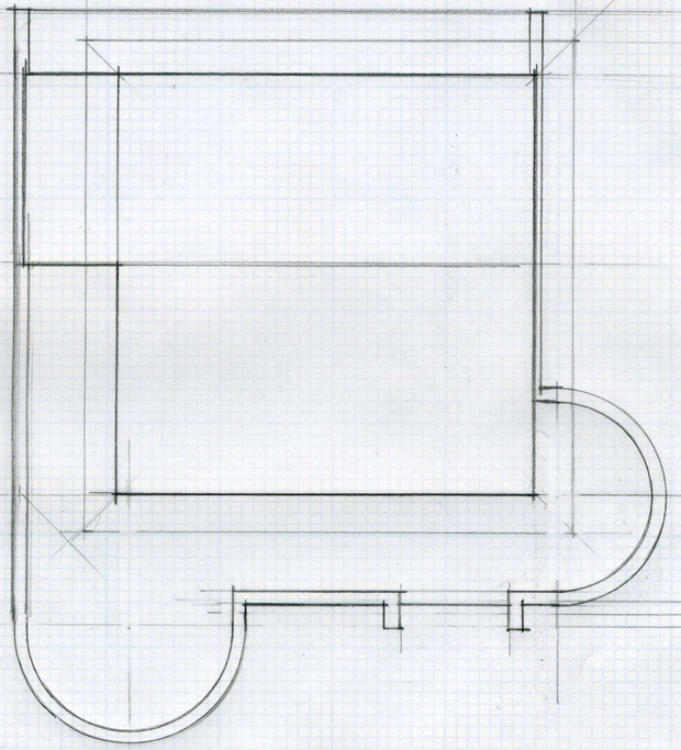 |
| Figure 8. Schematic first floor plan.
© John W. Geiger |
The dining-rectangle performs another function not so easily defined. By being congruent with the wainscot at both ends the design does a couple of things. The wainscot extensions are not tied together at their termini by the masonry wainscot, so the dining-rectangle performs that function. Visually any two parallel lines not related in some way tend to move or float around and appear to be unrelated. The dining-rectangle stabilizes these two lines, as well as firmly saying, "The house stops here," which the open ends of the wainscot do not do. The center of gravity of the first floor plan is somewhere just outside the inglenook.
The area over the dining-rectangle becomes its own rectangle on the second floor to accommodate two bedrooms and a bath. The attic space over the living room and entry and under the main gable becomes the studio. Together, they form two opposed rectangles.
 |
| Figure 9. Schematic Second Floor Plan. © John W. Geiger |
The studio already has its own roof but the bedrooms required a cross gable to provide a roof for them. The bearing walls of the bedroom rectangle are directly above the bearing walls of the first floor dining-rectangle, so that was no problem. The main, first floor gable overhangs the rear and front walls of the house by 3'-3". This area was used for closets with a sloped ceiling in the two bedrooms and for a portion of the bathroom at the center where the gable height allowed for a full 8'-0" ceiling height. The main gable overhangs of the front wall, becoming part of the studio. The roof lines are shown dotted on the above floor plan and the following roof plan (Figure 10). The roof plan shows the second floor as finally articulated, at least in outline.
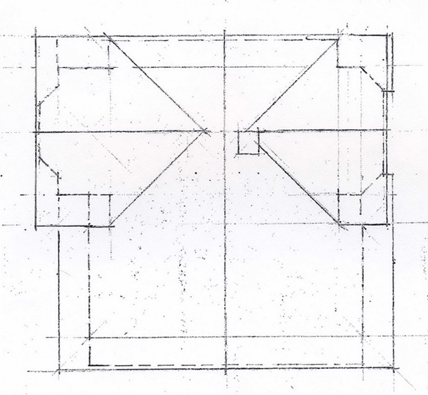 |
| Figure 10 Roof Plan © John W Geiger |
PHASE TWO: DESIGN DEVELOPMENT
By design development, I mean proceeding from the "Idea" to a finished design. In his best work Wright always started with the over all big "idea" and proceeded to the particulars without ever compromising the larger organizing principle. Remarkably, in this first work that conceptualization is in full force. Wright didn't have to understand, intellectually, what he was doing. All he had to do was listen for the inner voice that knew exactly the right thing to do to achieve an ephemeral quality that we call beauty.
The first and second floors as shown below are an accurate representation of the working drawings, which in turn proceed directly from the schematic drawings shown above. This particular drawing was probably drawn by Jack Howe for Hitchcock's In the Nature of Materials, published in 1942. In other publications, Howe acknowledges having produced the drawings in Figures 236, 286 and 288 from the Hitchcock publication. Since the floor plans shown here in Figure 11 are by the same hand as for Wright's 1889 house, I assume that Jack also did this drawing.
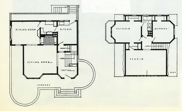 |
| Figure 11. First and Second Floor Plans for Wright's 1889 house.
© Frank Lloyd Wright Foundation. Used by permission. |
Wright's biggest problem in the design development phase was to maintain the dominance of the first floor gable in the finished product. This meant keeping the second floor bedroom gable roof subordinate to the first floor gable in accord with the "Idea." To accomplish this manipulation of the gable heights, the main gable was stilted about 16" (it is not dimensioned on the working drawings) on the first floor north and south bearing walls to position the soffit where Wright wanted it to come; just above the first floor window trim. The bedroom roof framing was, in contrast to the first floor stilted framing, set directly on the second floor plate and reduces that gable height in comparison to the main gable. The bedroom gable had the same overhanging and boxed eave as the main roof gable, but with a tight eave with the second floor wall at the north and south gables instead of the overhanging gable of the first floor roof. The geometry of the two roofs resulted in a very curious intersection of the two roofs at the rear elevation. The main gable and the bedroom gable were disposed at 90 degrees to each other but with an equal overhang over the same rear wall of the house, so that the eave of the bedroom gable becomes tangent with the rake of the main gable on the rear elevation. This solution was a very curious thing to do but a logical consequence of Wright's thinking. This scheme also became the first cruciform roof plan. See Figure 10.
When Wright perceived the relationship of the bedroom gable to the main gable in elevation, the master bedroom gable seemed too prominent in comparison to the nursery gable. So he just shifted the entire bedroom-rectangle to the south, creating the small balcony off the master bedroom and an overhanging second floor at the nursery. The maneuver worked and helped, but did not entirely solve, the massing of the elevations. Keep in mind the important fact that Wright was thinking in geometric terms. He moved the entire "rectangle" of the bedrooms, not just a wall. The ridge of the bedroom gable was far enough below the main roof ridge to be okay, but what Wright did not plan for and probably did not recognize is that he had created his first cruciform roof pattern. The roof plan clearly demonstrated this. However, the true cruciform was not to emerge until 1902, some 13 years later, with the Ross cottage.
The attic space over the living room and entry served as a spacious high ceiling studio for Wright's emerging architectural practice. The studio is 15'-0" x 23'-8" with a maximum ceiling height of about 12'-0". The maximum height of the main roof gable from the finish second floor to the ridge is about 18'-0," leaving an attic space of about 6' above the studio ceiling. The maximum height of the cross gable of the bedrooms is about 15'-0". The working drawings show a conventional 8'-0" ceiling for the bedrooms. However, they are not built that way. At some point, Wright raised the ceiling height in the master bedrooms with a tie beam at what is probably the same height as the 11'-0" ceiling in the studio. The hall, bath, and likely the nursery retained the 8'-0" ceiling, which leaves a10'-0" high attic space over those spaces at the ridges. A more vernacular way of roofing the second floor of this house would have been to terminate the main roof with a small gable at the ridge of the second floor gable, This would have instead eliminated the large attic space over the bath and nursery. That, however, did not fit the "idea." The big roof prevailed. The roof pattern dominates the design of this house and that idiom persists as a hallmark of Wright's work for the rest of his life.
Because of the 8'-1" plate height at the bedroom, the soffit gable height becomes what is about shoulder height inside the bedroom. He manages this okay on the south elevation and reduces the prominence of the second floor gable.
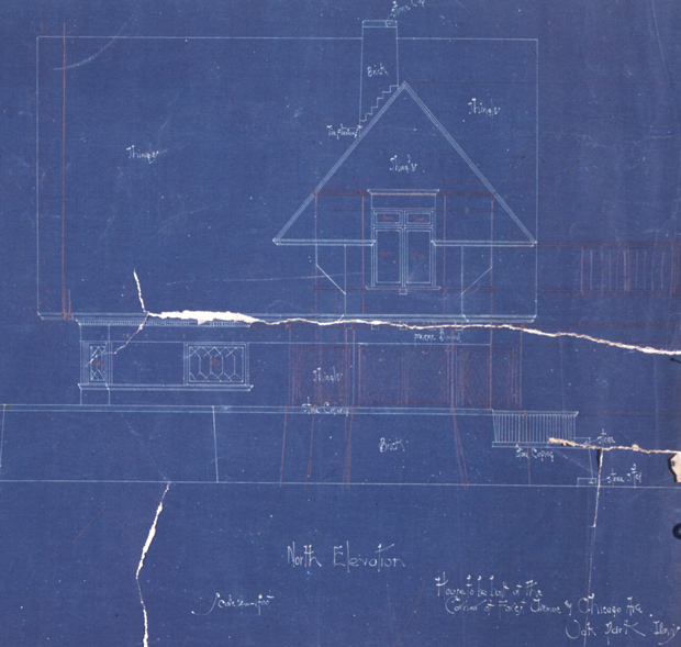 |
| Figure 12. South elevation, #8901.009. © Frank Lloyd Wright Foundation. Used by permission. |
The original design of the north bedroom fenestration is somewhat different from the south bedroom, as shown in the plan in Figure 15. The north bedroom has a bay window whose outside fenestration is flush with the tight gable and the side sash return at 45 degrees to the north wall of the room, which is in line with the first floor gable. I have said that Wright made all his design decisions in the floor plan stage. However, that doesn't always work and every job needs be studied in elevation as well as plan. Here the bay window fenestration that returns under the shoulder height gable eave just doesn't work. However, Wright did not change the design on the working drawings. One is left to assume that it was changed "on the job." The entire north wall was pulled out in line with the gable eave and the fenestration is a single pair of sash like the south bedroom. There is no 45 degree wall return like the south bedroom, but there are square windows added on each side of the main fenestration above the gable eave return and below the window head. These show up on the interior photographs of the restored bedroom but are not recorded on any plans or elevations.
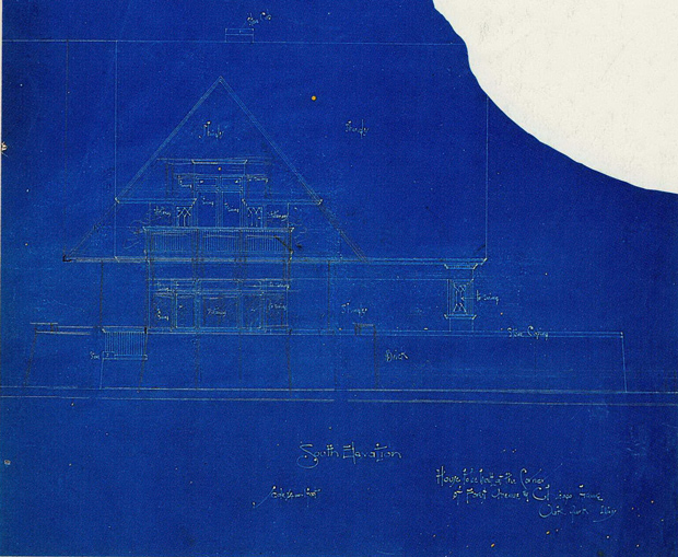 |
| Figure 13. North Elevation., #8901.005, as designed. © Frank Lloyd Wright Foundation. Used by permission. |
The square windows on either side of the glazed doors add substantially to the grammar in the north bedroom. They serve as a base for the mural above the fenestration which otherwise might seem to teeter-totter on the central fenestration. The projecting board above the windows is a very bold move and also visually supports the figure in the mural.
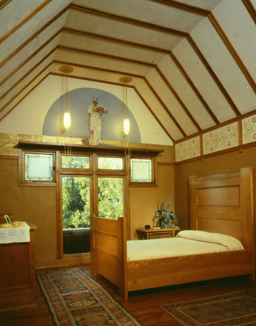 |
| Figure 14. North bedroom. |
The raised ceiling into the attic is an innovative use of available space to enhance the spatial quality of a rather small 13'x17' room. This obviously started with the studio in the attic over the living room and entry, where it was a logical consequence of the location. The north bedroom, though, took some imagination to execute, and the device works. The ceiling banding is also a bold move that gives scale and character to the room, transitioning to a wall banding that is twice the width of the ceiling spacing with its own stencil pattern. None of these lines coincide with any of the elements of the north wall containing the mural, except the bottom board of the wall banding which does carry on around the corner. There is yet another pattern introduced above this board on the north wall. The ceiling banding also tends to reinforce the idea that this is a wood and plaster building without looking like half-timbering, or a derivative thereof.
Having dealt with the roof, the most important element of Wright's design vocabulary, I will now deal with first floor plan, although there is not a lot to be said. Wright adds two equally dimensioned bays to the front elevation and develops the dining-rectangle as shown on Figure 15.
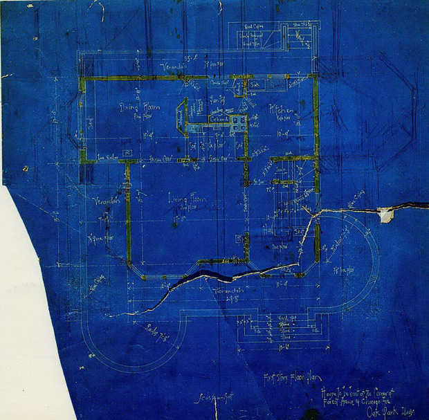 |
| Figure 15. First Floor Plan. #8901.002. © Frank Lloyd Wright Foundation. Used by permission. |
The single most interesting development is the "back porch," something Wright calls a "veranda." He carries the brick railing of the front verandas along both sides of the house to terminate as extensions and embrace the back porch, including a stair to grade. Wright ignores the fact that the stair is a stair and steps down to the lower grade by keeping the railing level and in line. He hides the inclined nature of the stair in his work for the rest of his career.
He lowers the top brick wainscot of this extension to the first floor elevation and caps the brick wall with a stone cap as he does with the railing of the verandas. A wood railing encloses the entire back veranda (See Figures 13 and 16), in an obvious decision not to carry the full masonry railing of the front verandas to hem the back veranda. Using the full height masonry railing to shelter a 4'-0' wide back porch would have been overkill. This gets me back to my previous point that the back veranda is there to extend, to the back of the house, the base or platform that began with the front verandas. The purpose is to create a stylobate on which to place the house.
 |
| Figure 16. East Elevation, #8901.008. © Frank Lloyd Wright Foundation. Used by permission. |
Wright takes a vernacular approach at the back veranda by supporting the structure with spaced brick piers, open underneath in the two center bays, enclosed by a lattice on the two outside bays, and with a simple wood railing (Figure 16). The wood railing suffices to tie the wood and brick elements together. The outside stairway to the basement is vernacular for the area and provides access to the back yard for the purpose of hanging out the laundry.
PHASE THREE: CONCLUSIONS
Wright's first house is noteworthy for the ideas represented, if not fully realized. The first of these is the relationship with the environment, namely the terra firma of a city lot. The integration of the house with the site by means of constructed features is not a new idea, but Wright became a master of this device and made it his own. In this instance, he established a plane, a stylobate, essentially parallel with the ground as an extension of the floor plane of the house, on which to base the house.
The second feature of the house is the tri-part elevation, consisting of a masonry 'wainscot' (an improper use of the word) from the ground up to railing height of the verandas, followed by the window-wall band, and the roof. He doesn't quite achieve that here, but it is implicit in the design. Obvious examples of where this device does work are the Winslow, Dana, and Huertley houses in two story schemes, and Cheney in a pseudo one-story scheme. The idea persisted in principle for the rest of his career as the horizontal banding of elevations.
The third is Wright's use of near classic geometry in everything he designed. The use of geometry in relationship of the roof plan to the floor plan in this first house is symptomatic of the future and the most relevant factor of the design.
In this modest 1889 house, the veranda plays an important role in the design of the front elevation to provide balance to the elevation, and is worthy of the time required to study exactly what Wright is doing with this particular element. Wright extends the brick wainscot with a 12" wide stone cap from the dining room as the veranda railing wall, extending and it well beyond the front of the house terminating in a semicircle with a companion semicircle on the south.
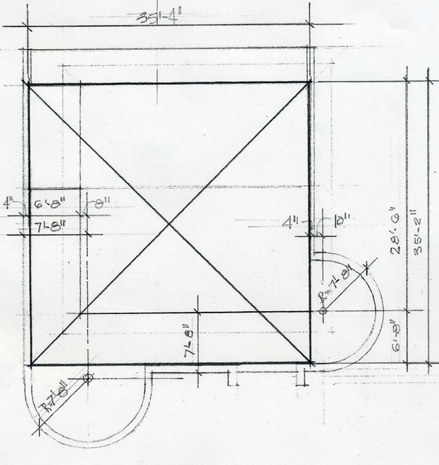
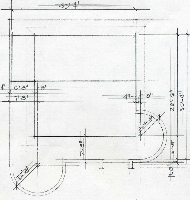
The development of the front verandas with their attendant semicircles is prototypical design development procedure for Wright, and I will attempt to define how Wright proceeded to address the problem at hand. I am, of course, drawing conclusions from the drawings that are available, but am working primarily from my own personal understanding of how he worked. The first consideration is the width of the west veranda parallel to the house, which has the same dimension, 6'-8," as the dining room off-set, creating a 'big-square' that is 35'-4" x 35'-2". Two sides are congruent with the existing essential-square, and the other two sides become spring lines for the two semicircle veranda railings (see Figure17). In the design process Wright always looked for something that was existing with which to relate what he was about to do, making each individual element a part of the whole. In this case, the 6'-8" dining room dimension met his need (see Figure 18). The 6'-8" dimension becomes the interior face of the veranda railing parallel to the west elevation of the house. By adding the 12" wide stone cap you have the 7'-8" semicircle radius. The center line of the south veranda is in line with the west wall of the hous. The center line of the west veranda is located by working backwards from the outside face of the stone cap at the dining room, placing the centerline of the west veranda semicircle 8" inside the face of the north wall of the living room, a perfect place for it. To have it directly in line with that wall would have been a big mistake.
 |
 |
|
| Figure 17. The Big Square. © John W. Geiger | Figure 18. Veranda Dimensions. © John W. Geiger |
A significant, and less obvious, contribution to an overall understanding of Wright is the back porch, veranda, or "back-veranda," and the role it plays as a relief valve to prevent this geometric configuration from becoming moribund. The masonry railing is absent here, allowing the internal forces generated by the geometry of the plan to escape their confines and relate to the space outside the geometric confines of the stylobate. The effect is very much in the same way Japanese print makers achieved by not confining their images with constricting borders.
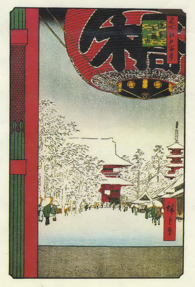 |
| Figure 19 Ando Hiroshige: 'Kinyuzan Temple, Asakusa'. One Hundred Famous Views of Edo, 1856. |
Meanwhile, back on the verandas, let us take a look at what else they do besides being part of a geometric composition. They additionally provide a visual base to support the house and do away with the typical exposed foundation wall, a device Wright detested. They also pull the structure of the house itself and into the site to grasp the landscape. Further, they also encompass the third element, only indicated here, that becomes a linchpin for future work: the reversal of the two semicircles at 90 degrees to each other. Most historians see this as rotation in terms of Froebel, but I see this relationship as opposing forces resulting in stability, not rotation.
Otto Graff comments on the Froebel influence, stating, "…and his references to Froebel may have been a ruse to throw off-track those contemporaries…" (Frank Lloyd Wright, An Architectural Primer, page 122, Princeton Architectural Press, 1991). I think so. The relationship of the two semicircular veranda walls might be seen an incipient cruciform that will become the true cruciform of the Barton house and a multitude of other houses. Such is already there in the relationship of the two roofs of this house, but here the use is more consciously geometric and diagrammatic, although less complete. Wright was very much aware of the geometry of the two semicircular veranda railings, but not consciously aware of the cruciform of the two roofs of the house. That would come much later.
An additional feature of the geometry of this house is for the verandas to give "balance" to the front elevation. Wright says, "…although symmetry may not be obvious always, balance is usually maintained." (In the Cause of Architecture, Architectural Record, XXIII, March,1908, p. 160). The front elevation of the house proper is essentially symmetrical about the centerline of the front gable, but the balance is upset by the dining room/bedroom extension to the north. Wright uses the verandas to restore balance to the front elevation. He made all his major decisions in the conceptual phase and the elevations were merely a graphic delineation of what had already been determined in plan. The process was always geometric. Here he uses semicircles to delineate the verandas, probably because the circular form was more harmonious with the triangular gable and the angled bay windows than a rectangular form would be, as well as with the two bays of the front elevation.
The layout and dimensioning of the verandas was very carefully orchestrated as I have previously shown in Figure 18, and was exactly the right thing to do. The extension of the south veranda beyond the south wall of the house provided the visual weight necessary to restore the center of gravity of the elevation back to the centerline of the main gable, where it belongs. There is no there, there, where the veranda railing crosses the centerline of the main gable, which is also what I would expect. The balance is achieved by the visual massing of the two verandas. Any feature on the building centerline would have been inappropriate. This is Wright's own way of avoiding an obvious centerline while maintaining the balance that a conventional centerline would provide. In the drawings Wright does make a try at placing an element on the center line of the west elevation, but it doesn't work and was fortunately abandoned.
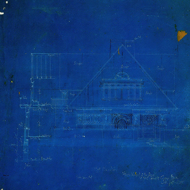 |
| Figure 20. West Elevation., 8901.006. © Frank Lloyd Wright Foundation. Used by permission. |
Wright interrupts the return of the veranda wall parallel to the west face of the house on the centerline of the entrance door to provide an entrance stair to the veranda and house. This device also records visual weight, or lack thereof, to the right of center that is also part of the balance equation. What constitutes balance in any architectural composition is obviously a very subjective judgment, but even at the tender age of 22 Wright's instincts were always correct. Not an intellectual, or even a considered judgment, the solution is pure instinct. That paradigm was what made Wright, Frank Lloyd Wright.
This first work of Wright is remarkable for originality of concept and as a precursor of things to come. There are also a couple of paradigms that he avoids here, and will avoid, for the rest of his life in all his houses. The first is that his design is never processional. As one exits the house through the front door and descends the 5 front steps to a paved landing, it would generally be assumed that you would then proceed, on the center line established by the entrance door and stair, and by way of a paved walk, to the street sidewalk on a path that might be consider processional. That doesn't happen here. The steps themselves and the landing are rather monumental for a house of 1,400 square feet. The bottom step is 13'-6" wide and the "landing" at grade is a paved area about ten feet wide and extends to the south to meet the driveway and then, by way of a right turn, to the street.
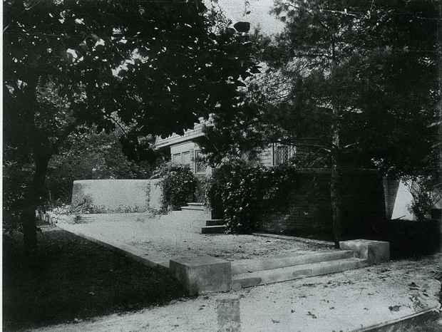 |
| Figure 21. Entrance Walk, 1889/95 Avery Architectural and Fine Arts Library |
The approach is is quite handsome and embraces the entrance steps in an appropriate manner. I suppose that the series of right and left turns is necessary to proceed from the street to the front door and can be seen as being processional in its own way, but that view doesn't shed any light on Wright's avoidance of a more simplistic, direct approach.
The pomp and circumstance of procession was pivotal for the Renaissance architect, as well as most other architects from any and all periods, but not for Wright. The Winslow house is probably the closest he gets to being processional, but there is a planting bed in the processional pathway that needs to be avoided. Once you are inside, however, the entrance hall is almost ecclesiastical. The Dana house also is also very processional with the exterior approach, but once inside you are confronted with a partial view of the rather ceremonial entrance hall but with a less than processional stairway to get there. Cheney, Hardy, and the Studio offer two non-processional choices for entry, and with two of them, you have a 50/50 chance of arriving at the desired destination. In the Studio you are in luck with either choice, but this is a very enigmatic pathway with which to confront that uninitiated seeker of entrance.
Buried in Wright's psyche there is a deep seated anxiety about the processional in general, and the entrance in particular. It is beyond my capability to explain these phenomena, but I do have a thought about the entrance. I think that is part of Wright's never demonstrating in any way how he worked. He purposely closed that door to the world. If you wanted entry to that world, you had to find your own route. The opportunity was there for Wright with the Taliesin apprentices to pass on his approach to architectural design and thereby preserve it for posterity, but there was never even the slightest hint revealed to the apprentices on that subject, except in broad philosophical terms. The semi-annual 'box' critiques were an opportunity to make statements on the subject, and they were sometimes enlightening, but again, mostly philosophical. However, he did speak freely on the subject of Japanese prints. There were occasional 'print-parties' held in the Taliesin studio where Wright showed prints and discussed the qualities that made them what they were. He loved his Japanese prints and loved talking about them.
The other non-understandable is his total avoidance of the inclined line of the staircase balustrade. Historically the stairway and stair-hall was a venue on which the architect could display his virtuosity in design. To the Renaissance architect it was the essential venue for that talent, as demonstrated by the Laurentian Library staircase by Michelangelo. Wright does invoke the grand entrance hall in the 1923 Moore reconstruction, but with very mixed results. He has all the ingredients for a monumental stair hall, but still avoids the inclined balustrade resulting in some almost grotesque solutions. Another example is the grand stair hall is Wright's Nesbitt house of 1940, where the stairs and a balcony do a lot of meandering around and essentially succeed. Even here, there are no inclined stair railings. Everything is resolved into horizontal and vertical lines. Wright, as early as 1889 in his own house, defines the stairway to the second floor with horizontal and vertical planes; no inclined lines here either, or in the foreseeable future.
The last element has to do with "relationships," a phrase I have previously used. In this case I mean the relationship of the two first floor bay windows to the two semicircles of the verandas. This relationship may seem a bit ephemeral to some, but for me, it works. Wright hangs the two bay windows of the outside corners of the front elevation, as he does with the two veranda semicircles which are set off the big-square (see Figures 15 and 17). It is a very curious thing to do with the bay windows, but works from the exterior frame of reference; a bit strangely in the living room interior, but essentially works. The two bays are similar in dimension but dissimilar in that one has a door as a central element while the other has a pair of windows, but the two bays are, as a pair, a major element in the organization of the front elevation.
The two semicircular veranda walls are also a pair and have an important role to play as an architectural organizing element in the front elevation. They have the same radius, but are disposed at 90 degrees to each other. They too are similar in one respect and dissimilar in another, like the two bay windows. The fact that each is a pair, and their forms in plan are compatible, is enough to establish what I see as a 'relationship' to integrate the diverse elements of the front elevation. The idea of relationships is a very complex consideration in understanding Wright's work and is introduced here as just one component necessary to the understanding this first work. Consideration in depth is to come.
I have segregated the work that Wright did for himself into a separate category which I call his "personal spaces." That work, starting with his own 1889 house, is in a class all by itself and is light years ahead of work he was doing for clients at the same time. The "personal" attribution is for obvious reasons and "spaces" because they tend to have been designed more from the inside out and a have greater spatial quality than the work for clients. This is to be expected and probably stems from extensive changes made over the years. They were laboratories for Wright. The first real masterpiece is the 1893 playroom added to the 1889 house, followed by the 1895 Studio and the 1896 Romeo and Juliet windmill, and the four configurations of Taliesin, Ocotillo, the 1932 Hillside Playhouse, and Taliesin West. I don't include his 1889 house as a masterpiece because there is essentially no spatial development, but it is included as a personal-space for reasons previously outlined.
I raised the question of beauty in Wright's work in my introductory WHY. In concluding this beginning offering I suppose I have an obligation to at least consider the prospect of that quality in his first work, particularity because I do not enter the structure into the masterpiece category. So, wherein lays the difference? Kevin Nute in his Frank Lloyd Wright and Japan, discusses at length the presence of beauty as being a product of "idea," citing Hegel and Kant (Van Nostrand Reinhold, 1993). I introduce the idea of "idea" early on and proceed to the schematics. The schematics are a graphic representation of an idea in its most basic form. This house, in total, does not meet my criteria for the rudimentary geometric relationship that I associate with beauty in Wright's work. We have to wait until 1893 to find that expression in the Playroom.
However, that doesn't mean that the 1889 house is not an important work. It is remarkable for the first work of a 22 year old incipient genius. What did emerge for this house are the main front gable and the verandas that provide visual support. I see the gable being supported not only by the two bay windows, but by a cushion of air. The gable is well configured and you don't feel compelled to move anything around. The working drawings show the eave return carried across the entire front gable. However, Wright changes his mind and stops the return in line with the front of the first floor bay window to let the shingles terminate the gable surface between these eave returns. This allows the forces generated within the gable to escape their boundaries and spill over into the verandas where they are retained by the masonry railing. Such is the device of the un-bordered Japanese print previously mentioned.
The elevations other than the street front leave something to be desired. The balcony of the master bedroom is overly fussy and unresolved. The bay windows of the front elevation look dated. The south elevation solves the gable problem okay, but otherwise doesn't have much going for it. The rear elevation is just there in all its inglorious self-expression. However, Wright is in full control in the schematic planning; a portent, as noted.
PHASE FOUR: SPECULATION
In conclusion, I would like to speculate on Wright's use of the square in his work. I have my own personal way of looking at how Wright worked and may or may not be parallel, at least in some way, to the way that Wright thought.
The square is the ultimate four sided plane geometric figure to which all other four sided non-square plane figures, namely rectangles, are related. As such, the square becomes a very primal form to be used with discretion. Wright starts this opus with the "idea" of the square roof of the essential-square and uses the big-square to set the dimensions of the front veranda. The square-in-plan main gable roof is very visible; the big-square is not. The two semicircles of the front verandas hung off the big-square, however, are very much in prominence. If you detach the two semicircles and join them you get a circle which has a very obvious relationship with any and all squares.
The two square windows of the north wall of the north bedroom have their vertical dimension preset by a location between the window head and the eave return. Wright makes a square with the horizontal dimension to bracket the central fenestration with a couple of big periods. He didn't want to make these windows part of the geometry of the central fenestration, which takes on greater relevance by its contrast with the square windows. Wright uses the square, starting with the "idea" to bring unity to the entire structure.